
Original dress image courtesy of swiked.tumblr.com.
What that dress teaches us about color management and converting photo color into print.
What color is this dress? We don’t see blue and black, or white and gold, we only see color management, color perception and output control that can be put into practice. To the uninitiated out there, the following blog post explores the issue of converting color we see onscreen to something which exists in the physical world as printed graphics, and how those colors will be output and perceived.
The Problem With On-Screen Color
The printing community is fairly sophisticated when it comes to color, so I’m pretty sure that the recent viral post debate that broke the Internet about “what color is this dress” felt a little ridiculous. Having said that, the dress image perfectly illustrates the problems that sign experts, designers, and print shops have to deal with on a daily basis when trying to match and recreate onscreen color to actual printable color for use on fabric, paper, banners, and other print materials. Especially when the only reference is a photograph.
Granted, the dress picture is an extreme example of this problem in lieu of the fact that it was photographed under extremely harsh light from above and could well have had filters applied to further manipulate the color, but the fact is that what we see onscreen is not physical color anyway, it is merely the image of color. When we try to force that color into the physical world of printing, there are many variables which need to be considered.
Color Matching the Dress
If we had to try to match this color for print output how would we do this? Ideally we would have to possess a color reference that was separate from the onscreen color version. The only way to get a true and accurate color match is about as “old-school” as you can get. You would have to have a Pantone, Toyo, ANPA, GMCI, RAL or similar color swatch book that you would hold-up to the actual dress and match the color by eye. Furthermore, you’d need to own the correct Adobe, Corel, VersaWorks RIP, or other equivalent software to translate the color swatch choices into the digital color version for printing with CMYK inks.
To try to bring some sanity to the worldwide dress debate, color and software experts at Adobe actually weighed in on the argument and have given us some reference to what the color of this dress is – taking the original RGB (JPG) image without any conversion or color correction and offering the following color palette to give us the only available color of this dress.
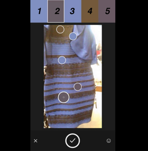
Image courtesy of Adobe
If you were interested in what the CMYK and RGB color values were according to Adobe, they are as follows:
RGB CMYK /PANTONE+ Solid Coated
- #6c7cb3 53%/39%/5%/0% | PANTONE 7682 C
- #544951 58%/59%/47%/22% | PANTONE Cool Gray 10 C
- #6c78b1 53%/42%/4%/0% | PANTONE 7674 C
- #60482c 45%/56%/80%/31% | PANTONE 7505 C
- #574751 57%/61%/46%/22% | PANTONE 437 C
The Color is Still Not Right
Unfortunately, this is the only solution that Adobe could offer but none of these colors could possibly be a match for the actual color of the dress. In fact, most of the Internet will never know what the true color of the dress is, unless they owned the dress itself.
This recent debate highlighted many issues when it comes to seeing and naming colors. As part of the print community, we are fundamentally aware of these problems and are further vexed by having to know how to output these colors – something in the print world that is just as important as choosing the right colors.
What the Dress Teaches Us About Print Color Management
As well as taking away the fact that the entire Internet is crazy, we can take away the following facts about color management that the dress post highlighted:
- Color is relative and inconsistent. The same color will appear to be or actually be different, depending on many conditions, including lighting, background, the color it’s next to, and other influencers that effect how color is perceived. Factors such as the material a color is printed on, the ink, drying temperature and printer settings will effect how a color is output.
- Managing color requires managing every step. From the camera that captures an image, to the computer that displays a design, to the design file, RIP software, ink, printer and material, every element involved should be controlled to truly achieve reliable, consistent results.
- Color gamut (the amount of color that can be seen or reproduced) is different for the human eye, monitors and printers, so a color you can see in real life or on a screen, cannot necessarily be printed.
Better Color Management
If this all sounds a little intimidating, the best way to start is to use profiles created specifically for the media and output device you use, and to calibrate your computer monitor in the location and lighting that you work most often.
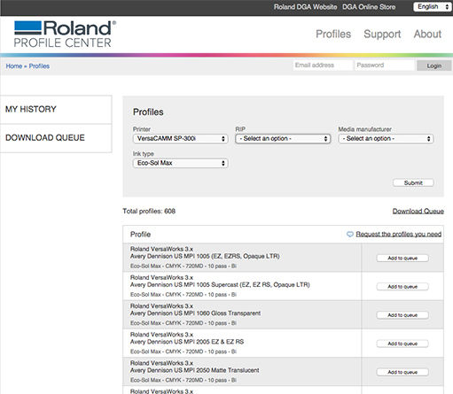
Our Roland DGA Profile Center allows you to set up ICC profiles for your Roland DG printer
Many media providers or printer manufacturers make custom profiles available to customers. Be sure to check out the Roland DGA Profile Center where you can obtain free media profiles for Roland DG printers and many common substrates from popular media manufacturers. There are also tools like those by X-Rite that can be used to create your own. Likewise, software such as Calibrize, Spyder4 and XRite ColorMunki Display are available to calibrate monitors (also see our list of color proofing solutions and color management partners)
One additional helpful tip when getting started, regarding the profiles attached to the design files themselves, is to use sRGB for designs that will appear on screen and Adobe RGB (1988) or better yet, North American Prepress 2 (to include U.S. Web Coated (SWOP) v2 for CMYK). This allows you to work in a wider gamut, and most RIP software can handle the conversion to CMYK or other inks just fine.
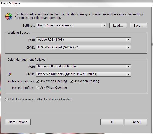
Illustration of ideal color profile set-up when outputting to Roland DG devices
The viral dress post illustrated what many people who work in the print and design industry already know – don’t trust your eyes when it comes to onscreen color. Instead, trust careful color management and thoroughness when it comes to photographing, matching colors and prepping for print, and always be mindful of the fact that seeing and replicating color is improved with the right information and process.
