We all know that there are many output factors that can affect color (heat, resolution, ink limit, profile, spot colors, etc.) There are also factors on the input side (occurring before you even bring a file into queue) that will influence the way the colors in a file will print. Creating a synchronized color works pace within your design software will give you the best chance of having predictable color across different design platforms and file types.
If you are working with Adobe® CS (Creative Suite®) or CC (Creative Cloud™), it’s important to note that these applications come defaulted with “North American General Purpose” 2 color settings and will not prompt you to change the color space if you open a different type of file. To be consistent with the “Prepress US” default in VersaWorks, we recommend changing the color settings to “North American Prepress 2.”
To synchronize your color spaces, follow these simple steps:
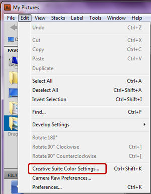
- Open the “Edit” menu in Adobe Bridge and click on the “Creative Suite Color Settings” tab.

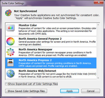
- Scroll down to “North American Prepress 2” and click apply.

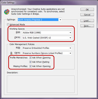
- Your color settings will now be synchronized through all of your Adobe applications (AI, PS, ID) to have the same color works pace as Prepress US in VersaWorks. You’ll also now receive prompts when a file you are opening or pasting into your chosen Adobe program has a missing or mismatched profile.


